How biased are Australian publishers during the election?
Several Weeks ago Col Allan arrived in Australia, and the media world was whipped into a frenzy. Suspicion grew that “Col Pot” was back to ruthlessly execute Rupert’s vision of decimating the ALP through his control of 59% of the newspapers read in Australia.
The run of Daily Telegraph front-pages that followed seemed to confirm the suspicions. But given News’ print numbers are in freefall – back more than 10% based on the latest audit – I became more interested in how the bias would surface in digital, where far more Australians are actually consuming their news.
So I spent a few hours over the weekend building something to analyse bias in online media coverage of the election. The result is The Headline Worm.
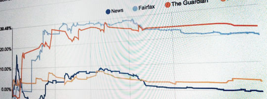
The Headline Worm grabs every headline published by The Australian, Herald-Sun, Daily Telegraph, The Age, SMH, ABC and The Guardian and stores them in a database. It then charts the bias over time of each publisher based on all of those headlines.
The results are somewhat surprising – and perhaps reflect more on the state of the election and the parties than the bias of publishers. While both Fairfax and the Guardian are more left-leaning, the ABC remains almost neutral with News sitting slightly to the right of the ABC. All publishers seem to swing slightly left or right together on a daily basis – a reflection of who’s made a gaffe or great policy that day.
I’ve already had a flood of questions about this, a few I’ll address below.
How is bias calculated? Detecting bias is tricky. There’s no way to automate it as bias is entirely subjective. So the way that bias is calculated is through visitors to the site ranking headlines without any idea of the publisher. I had my doubts about this system at first, but visitors were ranking several headlines when they visited, and there’s now at least 4 rankings per headline. It could be better, but given the polls that create so much of the election news are based on data from automated phone surveys interrupting the dinner of as few as 300 Australians, I’m not too concerned.
Why is it so wiggly at the start? At the beginning it was assumed everyone had zero bias. So the first few articles influence the overall bias for that publisher massively. Because the bias is cumulative, over time it becomes smoother and large jumps more unlikely.
Can I have the data? I’ll make all of the data downloadable at the end of the election.
Could you chart it in a different way? There’s a bunch of ways to chart this data. One of the most interesting is a scatter plot showing individual articles. I’ll try and get that up soon, along with a few other great ideas people have suggested.
What stops someone just spamming the rankings? There’s an automated way to stop this. I am however keeping the spammy rankings in a separate database to analyse at the end of the election. Because IP addresses are recorded with rankings I’ve already noticed some interesting geographical trends. I’d also suggest if you work for a publisher you shouldn’t be submitting 187 rankings in a row with the same bias (but thanks for caring so much).
- August 2013